
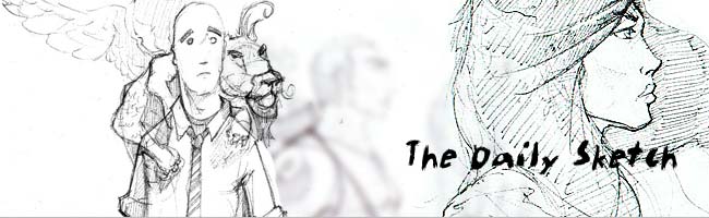
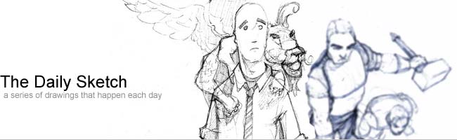
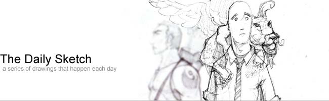
Thought I would put up some of my composites for my new header image on the blog.
I knew I wanted to use some of my current sketches but I was trying to figure out how to do and keep it clean and not too over-powering. I just started throwing some things together and got the first image.
I really like what I came up with but still seemed like too much. So, I moved onto the second composite, which is not as overpowering. I liked the composition much better and the font change fits too, but the blue sketch was bothering me. Now, the third one it has most of the qualities I want but I always like to add more... which leads us to the fourth one. It was the composition I liked best and the font is good plus it has some color to boot… Ok, on second thought, I don’t like it too much.
Ok, the winner is the third one!


No comments:
Post a Comment